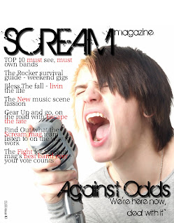
this is during the creating of my front cover it is mostly finished though there is still some work to be done. i still need to add a dark
partially transparent banner
across the top of the page on which i will put my 'free items' i also need to add my
bar code in the
bottom left corner as well as an ''exclusive' banner above my main sub heading. i think a strength is that the photo is pretty good quality and professional looking. although a weakness is that a didnt take enough photos with a variety of background.
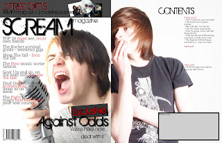
this is my finished front page, which is now in InDesign, and the begining of my contents page. the things left to be done are that the image need to match the same quality as the front cover photo, i'll do this by editing the images hues, saturation and brightness levels so it looks roughly the same style. i also need to finish the editors note in the gray box on the contents page and add a photo of me in it and i need to finish the actual content of the magazine down the right hand side. i think that the layout of the page is a stength but i think that the photo is a major weakness as the dark colour of the t-shirt makes it hard to see the text if i make it bigger and it goes over.
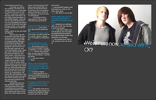
this is my double page spread, also in InDesign, i still need to finish my interview but other than that its looking fine. i realy like the colour scheme for these page though its different from the first two of red,black and white. i think the dark gray rather than black works realy well and doesnt make it more goom and doom rather than just a dark colour. a weakness is that i could only get two models though there are three people in the interview.
 this is during the creating of my front cover it is mostly finished though there is still some work to be done. i still need to add a dark partially transparent banner across the top of the page on which i will put my 'free items' i also need to add my bar code in the bottom left corner as well as an ''exclusive' banner above my main sub heading. i think a strength is that the photo is pretty good quality and professional looking. although a weakness is that a didnt take enough photos with a variety of background.
 this is my finished front page, which is now in InDesign, and the begining of my contents page. the things left to be done are that the image need to match the same quality as the front cover photo, i'll do this by editing the images hues, saturation and brightness levels so it looks roughly the same style. i also need to finish the editors note in the gray box on the contents page and add a photo of me in it and i need to finish the actual content of the magazine down the right hand side. i think that the layout of the page is a stength but i think that the photo is a major weakness as the dark colour of the t-shirt makes it hard to see the text if i make it bigger and it goes over.
 this is my double page spread, also in InDesign, i still need to finish my interview but other than that its looking fine. i realy like the colour scheme for these page though its different from the first two of red,black and white. i think the dark gray rather than black works realy well and doesnt make it more goom and doom rather than just a dark colour. a weakness is that i could only get two models though there are three people in the interview.
No comments:
Post a Comment