

 this is during the creating of my front cover it is mostly finished though there is still some work to be done. i still need to add a dark partially transparent banner across the top of the page on which i will put my 'free items' i also need to add my bar code in the bottom left corner as well as an ''exclusive' banner above my main sub heading. i think a strength is that the photo is pretty good quality and professional looking. although a weakness is that a didnt take enough photos with a variety of background.
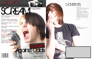 this is my finished front page, which is now in InDesign, and the begining of my contents page. the things left to be done are that the image need to match the same quality as the front cover photo, i'll do this by editing the images hues, saturation and brightness levels so it looks roughly the same style. i also need to finish the editors note in the gray box on the contents page and add a photo of me in it and i need to finish the actual content of the magazine down the right hand side. i think that the layout of the page is a stength but i think that the photo is a major weakness as the dark colour of the t-shirt makes it hard to see the text if i make it bigger and it goes over.
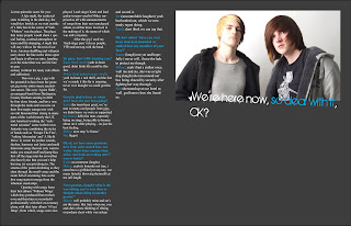 this is my double page spread, also in InDesign, i still need to finish my interview but other than that its looking fine. i realy like the colour scheme for these page though its different from the first two of red,black and white. i think the dark gray rather than black works realy well and doesnt make it more goom and doom rather than just a dark colour. a weakness is that i could only get two models though there are three people in the interview.

this is me adding some of my media work into my as media blog on blogger.com

here i am finishing the final touches to my front cover in photoshop before i start placing it into indesign, and working on my contents page and double page spread.

this is during the final stages of my as media product being finished. as you can see my frontpage has been placed into indesgin and my contents page and double page spread are almost complete.


 Studio: This is the media departments photography studio. It is ideal for shots that you want to make look very professional and clean, however fairly limmited to the backdrop.
 ACTOR: Mikey Wilson
 ACTOR: Steven Weston

 i thought that these styles of t-shirts would work very well as costume for a band being intervied within a music magazine. the dark colours clearly connote the dark nature of the genre of music with the pattern and style having rock music qualities such as the gothic cross and tattoo style floral design. the text used on the t-shirt also links to the genre of music, with the old, gothic styles font relating to the old subculture of goth in which their music style was very much apart of their lifes and is not to dis-simmilar to that contained in my magazine.
 this is a questionare i created in order to collect a better understanding of what it was my target audience found appealing in a music magazine for them to bu it, and continue to buy it. as well as finding out exctly what styles i needed to include within my magazine.
questionare on Prezi
 The main target audience of this magazine are younger generations of the 20Th century with keen interest in music based around rock to more heavier music this is suggested firstly by the amount of band known band names on the front cover which are highly visible with there use of colour scheme making them stand out from the mainly black front picture. Secondly though the title is covered by the front picture the name 'Kerrang' uses the use of Onomatopoeia for what sounds like the chord or playing of an electric guitar with an overdriven effect also with the text of the title having the look of glass that's been smashed by the sound.
 The big pictures of the content page show the featured story's and give a clear but brief insight into what the articles, within the magazine, contain. the layout is simple and continues with the previous house style of yellow, black and white which makes it stand out clearly from the background. the advertismentand in the top left of the next issue teases the reader with what it conains giving insentive to buy that issue next week.
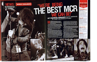
This is a double page spread from the kerrang magazine. the main focus of the article are the main pictures that surround the text creating a high picture-text ratio, the photos themselves are taken desaturated of colour making them fit in and continue with the colour style throughout the page with the hints of red complimenting the black and white and standing out. the title of the interview thats a quote thats been pulled from the interview is larger matching the picture size and is also slightly slanted causing it to stand out from the smaller more standard text to catch the readers eye. the may picture of gared way is place don the left, his attitude suggests that he is worn out or trying his hardest connoting the the quote "we're being the best mcr we can be"
METAL HAMMER:
 The front cover of this metal hammer magazine is faily plain with not alot goin on though the full page picture, of what we assume as a member of slipknot as prompted by it large subheading at the bottom of the page which is red makeing it stand out from the darker background and more still the white prin on top thats clearly visable above both colours, creates major drama on the page as the picture seems realy in your face and personal.
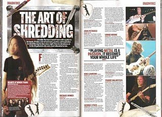
in this double page spread the layout is very simple and their is not particulaly any visable colour scheme other than the plan background and black writing with red for sub headings. the text massively out numbers the images which are farly small on the page on the far right. as the article is about solos "the art of shredding" the words themselfs seem to be on a guitar amp with guitar whires laying overtop, we assume herman li (lead guitar for dragonforce) is the one being interviewed or has a main part in it because hes picture is the bigest and is on the left at the start of the article. the article seems to be split up into different styles/tips/sections as the red lager text lets you know that its a new paragraph.
the quote "playing metal is a passion, it becomes your whole life" is the biggest text on the page, this being beside the pictures connotes that the pictures are other guitaring legends that feel playing metal is their whole life, also the words metal and passion are red making them stand out further and have some significant meaning to the person who the quote came from. the dragon force guitar picks scattered about the page also connote the genre of the magazine as well as the genre of the band which may allow relation from readers that enjoy that same genre.
ROCK SOUND:
 The front of the magazine is bright and airy, the lite blue give a feeling of youth and life. the use of yellow with in the colour scheme realy gives the front page some pop and adds excitement as yellows is assosiated with happyness, this colour could also link to the energy with the picture background of paramore as hayley williams seeming to be jumping from the page connoting the excitement of being young and free. the words 'free' (for the posters) and 'free cd' are also in yellow standing out from the blue but drawing us in with the offer of getting free gifts as well as the magazine its self. the name rocksound, though partly covered, is still vissable and still readable, the name itself connots the genre that the magazine is based around and lets us know the type of content within the magazine without looking. i like the technique of the scribbled text at the bottom of the page, it makes it easy to fit alot of magazine content on the front page while not makeing it look cluttered or covering the main photo.
the typography of the title, i.e the multi colours, also links back to the background colour, givving that beight airy and fresh felling to the band its depicting. as well as the orange possibly linking back to the artistist hair colour.
 the layout is fairly simple with all the content down the lefthand side, and although it seems a bit chaotic it is set out into seperate there is a constant colour theme throughout the page keeping it consistant and clean. the main features section clearly stands through the use of coloured text on a plain white background.


