2494 Chris Munden (AS re-sit)
Thursday, 14 April 2011
What kind of media institution might distribute your media product and why?
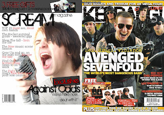 as you can see i have compared my magazine to kerrang. although the colour theme is different both magazines are very similar with big main titles and main sub headings kerrang magazine is distributed and owned by Bauer Media they own a large selection of magazines in a large variation of varieties, they also seem to own a lot of radio stations that also range in genre type. i think that Bauer Media would be interested in producing and owning my magazine putting it though the various stages of editing and producing on a mass scale.
i cose to do a music magazine as i have realised that their doesnt seem to be that many major music magazines that are sold in the shops, i chose the title to connote the genre of music its based on just like kerrang is.
having someone to distribute my magazine would raise my budget substantialy and help get it selling in the shops. the toubles of having a major distributer is that they may take over creative controle, therefor opting for a independant distributer may be a better option.
i have also taken into account the fact that i could distribute the magazine myself within the company possibly saving money keeping all creative desisions.
How does your media product represent particular social groups?
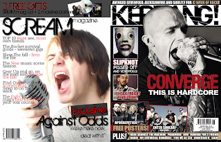 i chose mikey to be lead scream vocalist the pictures are very similar they're both medium shots of them from the torso upwards and are both lit from the left which creates deep shadows showing that they may have a darker side, ether in music or personality. both obviously like heavy metal as they are in heavy metal bands, although the kerrang mag is in black and whit we can assume that the singers t-shirt is black which makes them both wearing coulerless clothes and unlike my model he is bald wich connotes the stereotype of that rocker life style where you ether have long hair or non at all.
both postures seem violent but it more links to the intencity of music that they play, both shots are at fairly the same angle though my magazine is from slightly below and the kerrang is from slighty above which allows us to see more. of the model.
What have you leant about technologies from the process of constructing this product?

- touching up photos with phothoshops clone and stamp tools
- being able to resize an image so it fits and flows with the everything else
- adding guides to the page so everythning stays inline
- inserting othe pictures and getting rid of white with the magic wand tool
i used photoshop for creating my front page of my magazine
InDesign
what i leaned in InDesign:
- grids are in place already
- you can choose how many columns each page has for text
- you can make text mold around pictures
- i learned that you have to make pictures the exact pixels so that it does not become pixelated
i used InDesign to create my content page and double page spread
Blogger
what i learned about Blogger:
- easy to upload things
- easy to document each stage
- easy to inserting pictures and videos
i used blogger to document all of my media corswork for this unit
The studio
what i learned when using the studio:
- how to test the light settings and exposure
- settings for the flash lights
- how to connect the flash lights to the camera its self
- getting the tripod at the right hight
- knowing what shot to use
i used the qe photoshoot studio to take all my photos that i would need for my magazine
Looking back at your prelim task, what do you feel you have leant in the process from it to the full product?
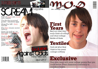
i have learned things throughout the process of making my final product (left) that has improved my skills since my print prelim (right). as you can see the image quality of the photos has increased and my final product now looks more clean, crisp and more professional, the actual choice of photo is better as in my prelim i have used a white t-shirt on a white background which makes the models head seem to be floating and just makes it seem amaturistic. the layout is simmilar but the over use of the same text, colour and shadow drop in the prelim just make it look plain and no longer makes ether the magazine title or sub headings stand out from the page unlike my final product that varies in text and the red 'exclusive' stands out from everything else. i have learned that i need to add more text into my front page as seen from the 7 sub headings on my final, compared to the 3 on my prelim, making it seem more well made and improving the contents quality of the magazine.
Saturday, 19 March 2011
Rough Cuts
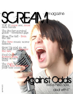 this is during the creating of my front cover it is mostly finished though there is still some work to be done. i still need to add a dark partially transparent banner across the top of the page on which i will put my 'free items' i also need to add my bar code in the bottom left corner as well as an ''exclusive' banner above my main sub heading. i think a strength is that the photo is pretty good quality and professional looking. although a weakness is that a didnt take enough photos with a variety of background.
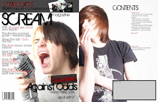 this is my finished front page, which is now in InDesign, and the begining of my contents page. the things left to be done are that the image need to match the same quality as the front cover photo, i'll do this by editing the images hues, saturation and brightness levels so it looks roughly the same style. i also need to finish the editors note in the gray box on the contents page and add a photo of me in it and i need to finish the actual content of the magazine down the right hand side. i think that the layout of the page is a stength but i think that the photo is a major weakness as the dark colour of the t-shirt makes it hard to see the text if i make it bigger and it goes over.
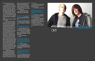 this is my double page spread, also in InDesign, i still need to finish my interview but other than that its looking fine. i realy like the colour scheme for these page though its different from the first two of red,black and white. i think the dark gray rather than black works realy well and doesnt make it more goom and doom rather than just a dark colour. a weakness is that i could only get two models though there are three people in the interview.
Screenshots of Production Process
this is me adding some of my media work into my as media blog on blogger.com
here i am finishing the final touches to my front cover in photoshop before i start placing it into indesign, and working on my contents page and double page spread.
this is during the final stages of my as media product being finished. as you can see my frontpage has been placed into indesgin and my contents page and double page spread are almost complete.
Behind The Scenes Images
Article Drafts
Style of your article (e.g. interview, review): mostly interview
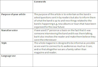
Beginning of article:
Let me paint the scene for you:A late night, the scattered stars twinkling in the dark sky, the wind blew briskly as we wait outside of a little bar in the centre of York. “Fibbers” was the place. The place that many people would share a special feeling, a united atmosphere intense and life changing, A night that will stay with us for the rest of our lives. Anxious shuffling and whispers carry down the line as the doors open and begin to allow us entry, handing over the ticket that was our life line to pure ecstasy (without the nasty side effects and addiction).This was a gig, a gig with the potential to have been the greatest gig in my entire music journalist career. This was ‘Against Odds, an unsigned band from Darlington, County Durham starting in 2006 by four close friends, and have rose through the ranks and was now several thousand fans strong in many parts of the world (mostly the UK and America) working the “rock/metal screamo” scene in their own fantastic way, combining the styles of bands such as ‘Escape The Fate’, ‘Asking Alexandria’ and ‘A Skylit Drive’ to create the perfect sounds, rhythm, harmony and lyrics and meld them into songs that not only want to make you smash stuff and jump face first off the stage into the crowd but also have lyrics that you can’t help but sing (or scream) along to, The strums of the guitar deafening as the slam through the small venue a well as the room full of screaming fans as the first song starts to merge from the inhuman sized amps.Opening with songs from their first album ‘Without Wings’ which they produced first on their own and then later re recorded it professionally with their own money along with their later album ‘6 Feet Deep’, from which, songs were also played. Lead singer Rachel and lead guitar/scream vocalist Mikey surprised us all with announcements of songs from their new unreleased album, to all but those involved in the making of it, the name still a mystery.
Photoshoot Plans
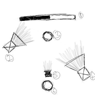
1. backdrop: i want the backdrop of my photoshoot to be half black and half white. connoting a sence of darkness yet also a sence of purity.
2. back lighting/ key light: i plan to have one of the flash lights further back and angled more toward the backdrop causing the backgrond of the photos to stand out from my model/s, while also providing subtle lighting on the right side of the models.
3. the model/s
4.fill lighting: provided the the light that will make my photos look professional, crisp and clear.
5. camera.
6. me
Recce of Location
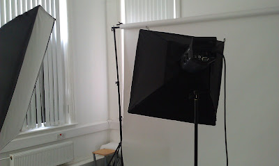 Studio: This is the media departments photography studio. It is ideal for shots that you want to make look very professional and clean, however fairly limmited to the backdrop.
All though it alows for the sheilding of external factors such as weather, atificial light will never beat natural light. There are no restrictions to useing the studio as it is readily available to all media students providing it is not already booked or in use. The studio provides a lot of flexibility as it alows me to move the positions of lighting to create the desired effect on the photo. There are no possible issues in terms of risk assessment and no chance of creating an issue of informed consent as it will only be the actors within the photoswhos consent i already have.
Call Sheets & Model Release Forms
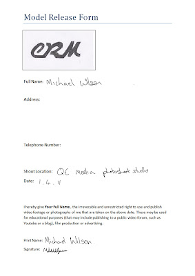
 ACTOR: Mikey Wilson
CHARACTER: Lead guitarist and vocals of band
CALL TIME: 10:30
DATE: 01/4/2011
COSTUME: New rock/metal style
MAKE-UP: n/a
LOCATION: QE media photoshoot studio
SET: Scream magazine photoshoot studio
PRODUCER: Chris Munden
DIRECTOR: Chris Munden
PHOTOGRAPHER: Chris Munden
Release form signed: yes
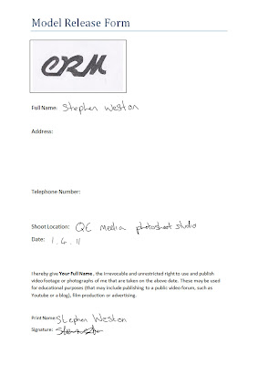
 ACTOR: Steven Weston
CHARACTER: Bassest of same band
CALL TIME: 10:30
DAY/DATE: 01/4/2011
COSTUME: New rock/metal style
MAKE-UP: n/a
LOCATION: QE medi photoshoot studio
SET: Scream magazine photoshoot studio
PRODUCER: Chris Munden
DIRECTOR: Chris Munden
PHOTOGRAPHER: Chris Munden
Release form signed: yes
Sourcing Props & Costumes

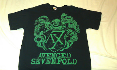 i thought that these styles of t-shirts would work very well as costume for a band being intervied within a music magazine. the dark colours clearly connote the dark nature of the genre of music with the pattern and style having rock music qualities such as the gothic cross and tattoo style floral design. the text used on the t-shirt also links to the genre of music, with the old, gothic styles font relating to the old subculture of goth in which their music style was very much apart of their lifes and is not to dis-simmilar to that contained in my magazine.
the avengend sevenfold t-shirt was also a prime choise as the style of music associated with that band connotes to the genre of music of the band my models will be acting. it is also a good portrail of real life as many bands within the music industry wair othe bands t-shirst as it is those bands that have influenced them into joining the music industry in the first place.
Proposal, Initial Treatment & Institutional Context
The front cover of my magazine will be fairly plain yet stylish and still fitting with the genre, though not to plain so that it makes it look boreing or amaturistic. the title will have a thick black outline and be streached accross the top of the page and stood out above the main picture that creates the bacground of the front page. The main subheading of the band background is spread across the middle, the main sell lines will be accross the left and rights with other bands within the mag accross the bottom also with adverts to win things and free items cept in order with the rest of the page.
i will be creating all of the disigns for myself using photoshop.
the magazine now goes into production after the final go ahead and shiped to stores to be desplayed and then bought by target audience.
as i am only creating a font cover i will not be putting it into prduction or sale.
Audience Research (Primary)
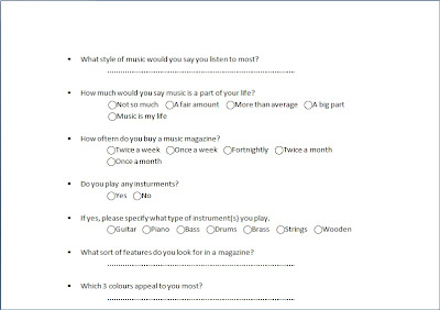 this is a questionare i created in order to collect a better understanding of what it was my target audience found appealing in a music magazine for them to bu it, and continue to buy it. as well as finding out exctly what styles i needed to include within my magazine.
questionare on Prezi
Audience Research (Secondary)
Audience interests/beliefs: My magazines target audience are strong minded individuals that hold fast to their own beliefs and ideas never to let others bring them down or tell them different that are drawn into the steryotype of being too alternative or individual which are outcast or ridicueled for being to different. They have a large interest in music and play at least one instrument and wish or dream about a career in music.
Social-economic class and background: The magazine is not aimed at a specific social class or background, just a magazine for those interested in the music styles within the magazine.
Focus Group: http://bit.ly/azaLq3
From my focus group, a reprasentative sample of my target audience, i found out that all my ideas where fine. Though sugestions where made and where taken into account to effect the final product. e.g. found out what text was best, and prefered colour schemes
Textual Analysis
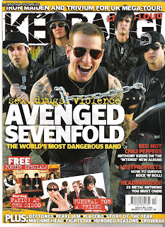 The main target audience of this magazine are younger generations of the 20Th century with keen interest in music based around rock to more heavier music this is suggested firstly by the amount of band known band names on the front cover which are highly visible with there use of colour scheme making them stand out from the mainly black front picture. Secondly though the title is covered by the front picture the name 'Kerrang' uses the use of Onomatopoeia for what sounds like the chord or playing of an electric guitar with an overdriven effect also with the text of the title having the look of glass that's been smashed by the sound.
The magazine price is cheap which not only makes it more appealing but is that price for the target audience so that their not splashing out for a magazine that's produced weekly, although a higher price would still be acceptable as normally every issue comes with 3-4 a3 or a4 free posters. Although the layout seems to have a fair amount of writing the page is not cluttered and does not appear untidy or unprofessional.
The main image itself is a wide shot of the whole band 'Avenged sevenfold' which the reader can clearly know by the large sub heading associated with the picture, which relates to the text 'sex, drugs, violence... the worlds most dangerous band' as the band are in mostly black clothing and/or leather jackets holding street war weapons, such as the metal pole and thick metal chain, with hardend, angry faces making them seem aggressive as the text suggests as well as supporting a sence of intimidation given to the reader.
Some of the major sell points is the huge sell points is the huge amount of extra band interviews clearly seen by the white text on yellow at the bottom of the page, other huge sell points are the side lines such as 'How to survive rock'n' roll' which connotes the hectic lifestyle that younger generations live, maybe even to use on how to survive their day to day lives.
 The big pictures of the content page show the featured story's and give a clear but brief insight into what the articles, within the magazine, contain. the layout is simple and continues with the previous house style of yellow, black and white which makes it stand out clearly from the background. the advertismentand in the top left of the next issue teases the reader with what it conains giving insentive to buy that issue next week.
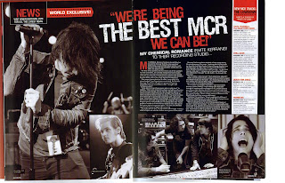
This is a double page spread from the kerrang magazine. the main focus of the article are the main pictures that surround the text creating a high picture-text ratio, the photos themselves are taken desaturated of colour making them fit in and continue with the colour style throughout the page with the hints of red complimenting the black and white and standing out. the title of the interview thats a quote thats been pulled from the interview is larger matching the picture size and is also slightly slanted causing it to stand out from the smaller more standard text to catch the readers eye. the may picture of gared way is place don the left, his attitude suggests that he is worn out or trying his hardest connoting the the quote "we're being the best mcr we can be"
METAL HAMMER:
 The front cover of this metal hammer magazine is faily plain with not alot goin on though the full page picture, of what we assume as a member of slipknot as prompted by it large subheading at the bottom of the page which is red makeing it stand out from the darker background and more still the white prin on top thats clearly visable above both colours, creates major drama on the page as the picture seems realy in your face and personal.
The claw marks that seem to rip through the page links to the quote "this band is at war" making them seem almost like battle scars or a result of some sort of attack.
The tital of metal hammer itself is designed to look as though its actualy made of metal, this aslo combined with the dark colours show that the magazine is set on a genre from heavy metal to more hardcore music.
There are no sell lines on the page other than the advertisement of free stuff within that issue and the chance to win somthing wich are put clearly on the page to attract the readers attention and make them want to buy the mag.
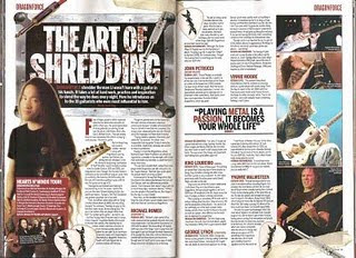
in this double page spread the layout is very simple and their is not particulaly any visable colour scheme other than the plan background and black writing with red for sub headings. the text massively out numbers the images which are farly small on the page on the far right. as the article is about solos "the art of shredding" the words themselfs seem to be on a guitar amp with guitar whires laying overtop, we assume herman li (lead guitar for dragonforce) is the one being interviewed or has a main part in it because hes picture is the bigest and is on the left at the start of the article. the article seems to be split up into different styles/tips/sections as the red lager text lets you know that its a new paragraph.
the quote "playing metal is a passion, it becomes your whole life" is the biggest text on the page, this being beside the pictures connotes that the pictures are other guitaring legends that feel playing metal is their whole life, also the words metal and passion are red making them stand out further and have some significant meaning to the person who the quote came from. the dragon force guitar picks scattered about the page also connote the genre of the magazine as well as the genre of the band which may allow relation from readers that enjoy that same genre.
ROCK SOUND:
 The front of the magazine is bright and airy, the lite blue give a feeling of youth and life. the use of yellow with in the colour scheme realy gives the front page some pop and adds excitement as yellows is assosiated with happyness, this colour could also link to the energy with the picture background of paramore as hayley williams seeming to be jumping from the page connoting the excitement of being young and free. the words 'free' (for the posters) and 'free cd' are also in yellow standing out from the blue but drawing us in with the offer of getting free gifts as well as the magazine its self. the name rocksound, though partly covered, is still vissable and still readable, the name itself connots the genre that the magazine is based around and lets us know the type of content within the magazine without looking. i like the technique of the scribbled text at the bottom of the page, it makes it easy to fit alot of magazine content on the front page while not makeing it look cluttered or covering the main photo.
the typography of the title, i.e the multi colours, also links back to the background colour, givving that beight airy and fresh felling to the band its depicting. as well as the orange possibly linking back to the artistist hair colour.
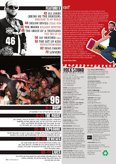 the layout is fairly simple with all the content down the lefthand side, and although it seems a bit chaotic it is set out into seperate there is a constant colour theme throughout the page keeping it consistant and clean. the main features section clearly stands through the use of coloured text on a plain white background.


